LingoAI: Design Case Study See it live
[INTRO: THE PASSION FOR LEARNING]
To this day, the one thing I value the most is my passion for learning. I don’t know if it stems from my ADHD or something else, but bettering myself everyday is pretty fufilling. One of these was learning a language. I grew up bilingual (English, and Vietnamese) and learned both Spanish and Japanese in education. At the time, I was really focused on Japanese and that lead me to study abroad in Japan for a semester. I’ve got to say it was one of the best experiences of my life but that’s a story for another day.
This is probably the main reason I wanted to start LingoAI. As for the name — If you don’t know me quite well yet, I love wordplay. Ringo (りんご) is apple in Japanese but sounds like “lingo” if you were to prounounce it in Native Japanese.
[ANIME INFLUENCE]
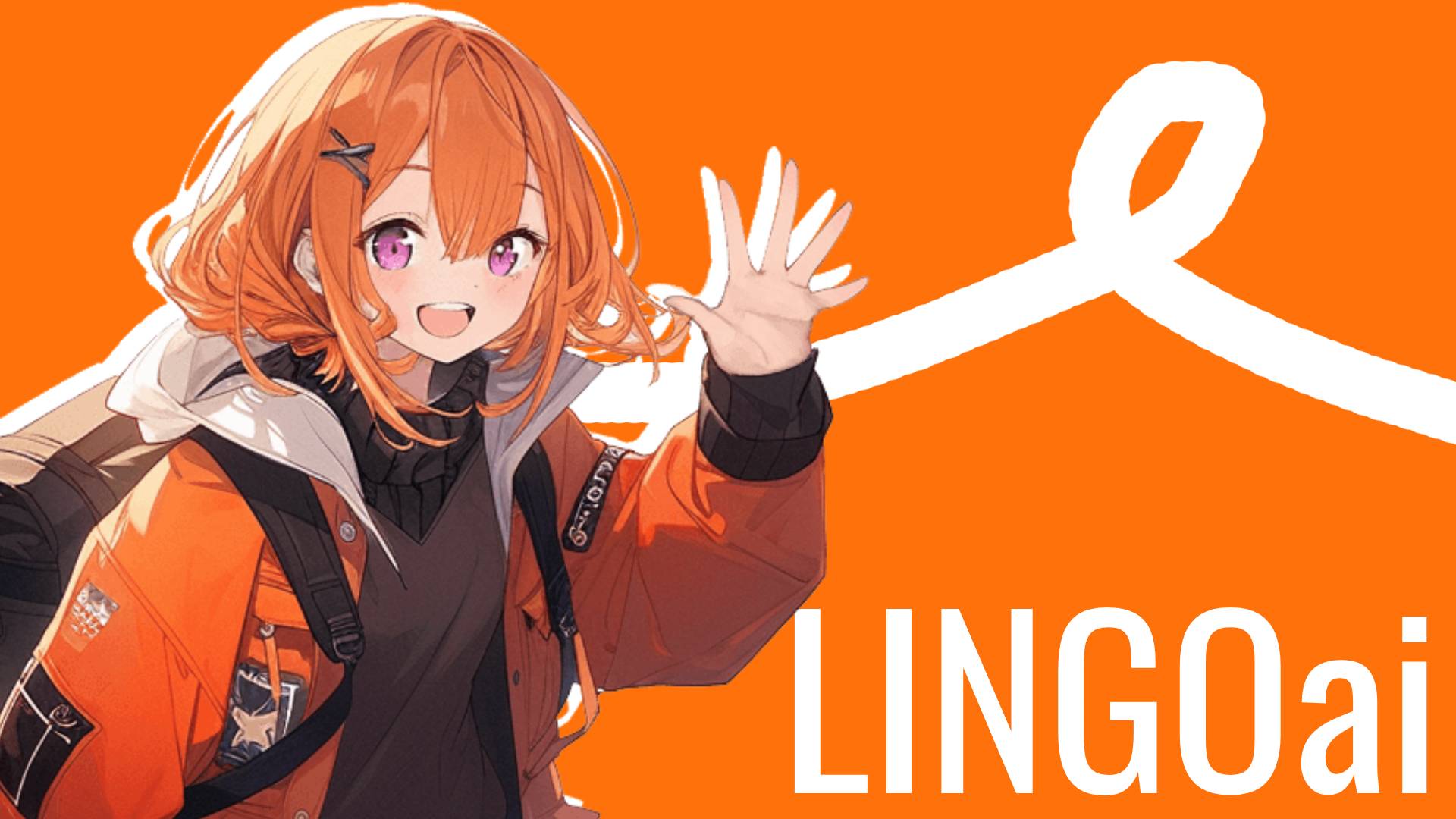
Of course one of the main reasons for me to learn Japanese was anime influences. Because the project is driven by AI, why not put “faces” behind the AI to give it personality? From there I started to work on a design. I wanted to incorporate an orange accent color to indicate energy and youth. Orange is a pretty vibrant color that provides high contrast to keep you excited. Next I wanted to quickly draft up a main “character” for the face of the brand and the quickest way for me to do that was through midjourney. After numerous prompts I was satisfied with the results.
Since AI isn’t perfect (but damn near perfect), I did run into some “discrepancies” with the results that the AI generated. Below in an example of the anime girl in the hero of the design. Using my art skills I was able to fix the hand and make minor touchups to the foot area. This is really meant as a placeholder until I’m able to go back in and redraw the assets!. The foot area isn’t as important since our eyes are usually drawn to the face of the subjects, which the hand is near.
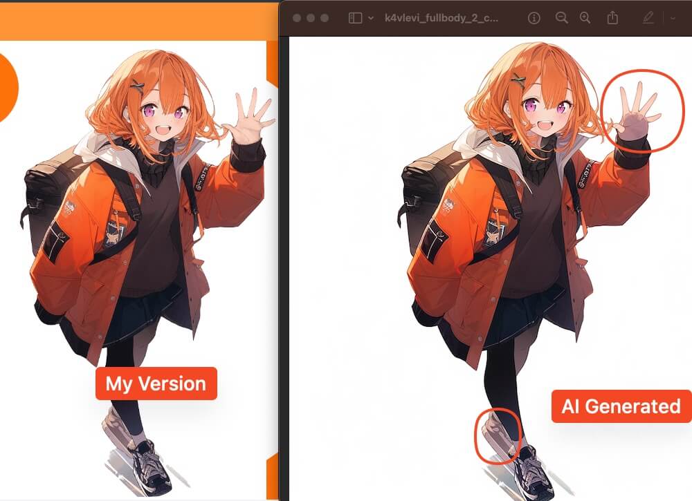 Comparison of AI Generated Image and my fixes
[♪ SIMPLE, AND CLEAN IS THE WAY … ♪ ]
Because my main focus is with the actual AI application for now… I wanted to keep the design simple. I added a couple of animations to draw the eyes like this rotating “hello” block. It’s a pretty nifty animation but also implies the different languages you can use LingoAI for.
 Animation of 4 different hellos in different languages
Next section is the features section. The purpose of this was to showcase what you can do with LingoAI. I’ve kept it simple here as well showing a small video snippet for each feature. I used a phone here to showcase how “convienient” it is and that it’s accessible anywhere. I included our orange haired mascot for some personality! These video snippets were done in Adobe After Effects
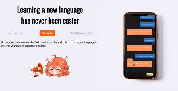 Features of the LingoAI app
The site really does seem simple even with all of this laid out. I plan on improving this in the feature after I can get more of the actual application moving along! Tune in next time where I talk more about implementation.