D&D Friend Bot: Design Case Study See it live
[INTRO: EXPLORING 3D]
So I stumbled into a really neat 3D solution called Spline3D. In short it’s a 3d model editor that you can use and render on the web. You can also include logic and game controls if your project calls for it! This was something I really see alot of potential in and wanted to explore a little more.
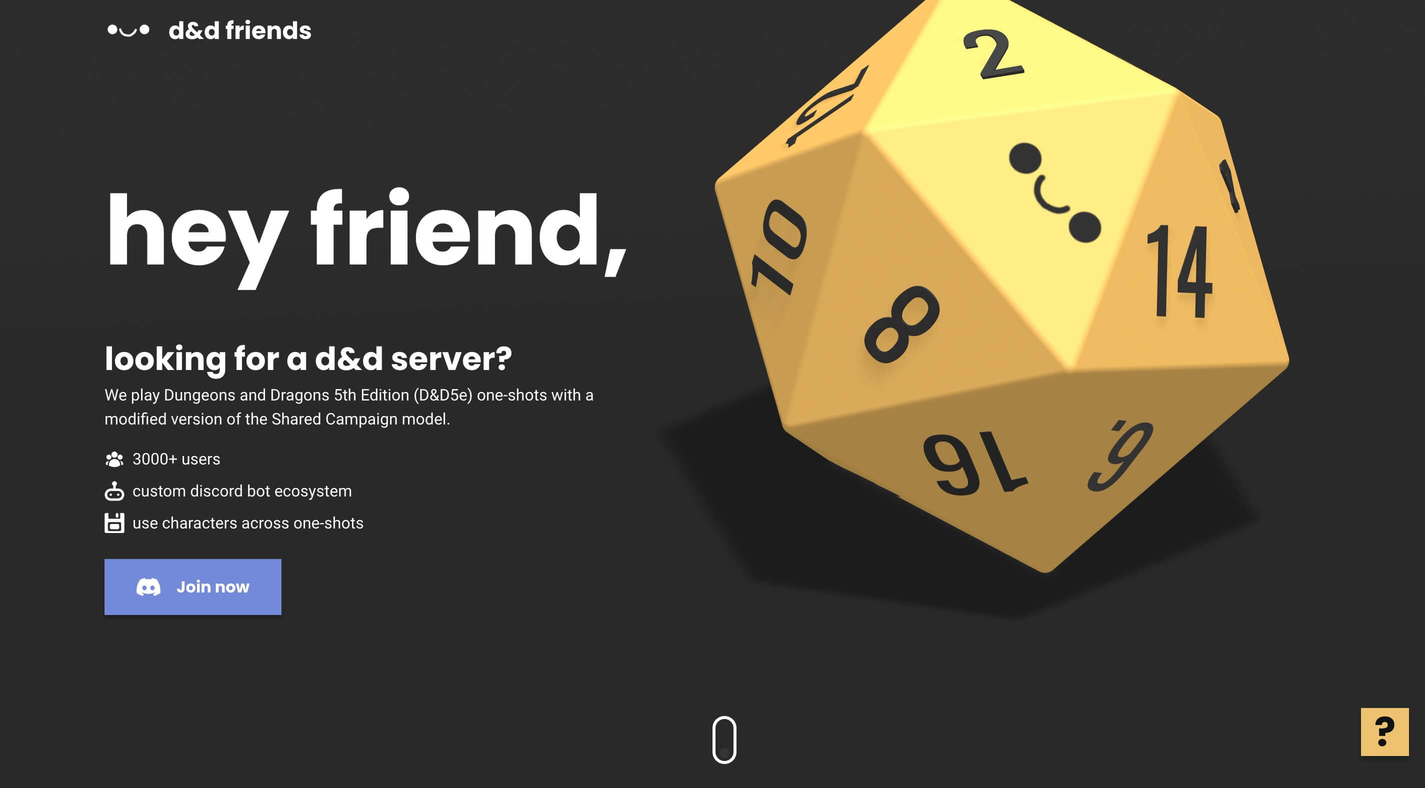
[ROLL THE DICE!]
As a spline beginner, I wanted to incorprate a 3d feature that’s super simple. When you think simple you think of something like a shape — a circle or a square. In this case I think an isocahedron (20 side) was a simple enough 3d shape that was already included right out of the box on spline!
In short I colored the cube yellow and attached a number on each side using an actual die as reference. I then added Spline’s drag and drop feature and physics so you can physically roll the die! (so cool).
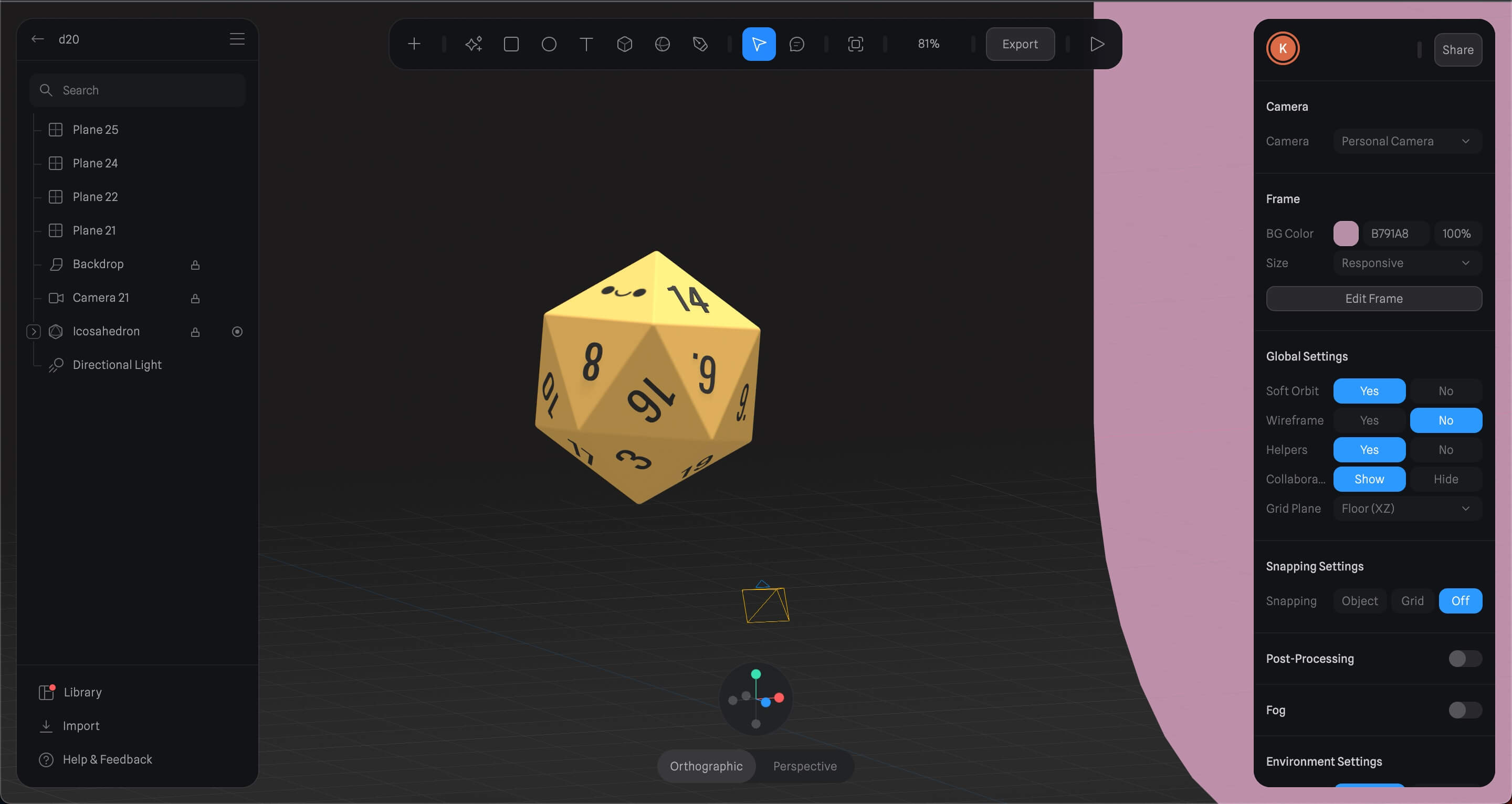 How the spline 3d editor looks like — building out my die!
I ran into a couple of challenges with the die when I embedded into my code. The first one was that the die would sometimes roll out of the screen. I added some transparent walls so that this wouldn’t happen. Secondly there were some dragging issues on mobile that I couldn’t quite figure out with Spline. Spline’s scene interaction settings lets you either enable page scroll or not. This does not work well with the drag and drop functionality that Spline provides. Since scrolling and drag/dropping happens with our thumbs only one interaction can happen at a time.
Other than that the hero is pretty straightforward. The content on the left draws the user in personally with casual language (hey friend,) and some off the bat items to get the user’s hooked.
[YOU STILL WITH ME?]
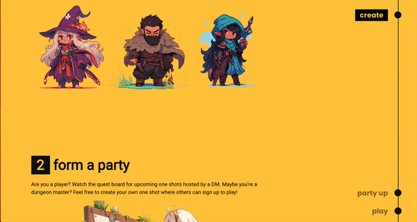
Now the hero’s fun an all and the user MIGHT be interested… but as what if they never played dnd online before or… at all? I decided to add a simple 1, 2, 3 steps section so that the user can understand how some of it works. I don’t intend for them to understand it all right off the bat but help the user understand that it’s easy as 1,2,3 to join and play. My goal here is to not get them overwhelmed with information but good enough for them to join the server and learn more about it there!
I also decided to make this a high saturated section with yellow so user’s can shift their focus to the next section. If I had made the separation too subtle I’d feel like the user would still be drawn to the dice since it is pretty fun to play with.
Finally there’s a neat parallax effect on scroll that adds to the section. It’s interactable too! In my opinion though the section does feel a little plain. It’s missing one small thing that I can’t put my tongue on but it’s something I can revisit later as I work on more designs!
 Parallax scroll effect in action!
[LESS IS MORE]
At the end we end with another call to action button to join the server. There’s not too much on this landing page on purpose and it’s kind of hinting to the user that you’ll get to see more once you join the server. I think there could be at least one more section (no more no less) for FAQ’s at least to answer some immediate questions or even a section to show a glimpse of the discord bot in action. The latter is what I would be learning towards but requires some editing skills to pull off.